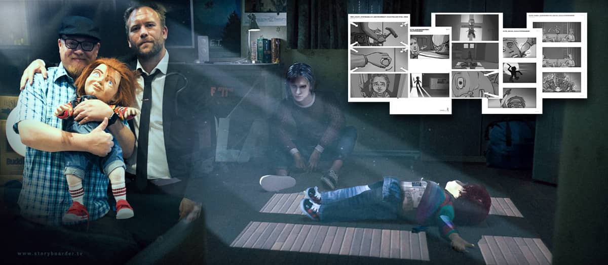
Won pitch with Norwegian storyboard artist for a Hollywood film production
UNEXPECTED REQUEST!
The director Lars Klevberg contacted me out of the blue with a request: Would I help him with his pitch for a directing job – a remake of the classic horror movie Child’s Play? The client was no less than Metro-Goldwyn-Mayer. The project was hush-hush and had to be kept a close secret.


Network = undreamed-of opportunities
He had been given my name by a mutual acquaintance, the scriptwriter and lecturer at Westerdals (Kristiania University College), Peter Eisenstein. Lars could tell me that “The script is superb and I’m looking forward to pitching it. Particularly now that I can also give them a storyboard.” Wow! Perfect for a storyboard artist like me.


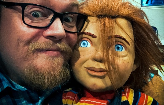
1. Quick idea sketch 2. Reference photo of myself (At the risk of looking like an idiot :). 3. Finished cleaned up storyboard sketch.
Dramatisation in images
We had about a week to develop the storyboard for an important scene in the film script. A big difference from the original version was that Chucky, the doll, would be more AI than possessed. The story starts by giving Chucky a more sympathetic angle. His character then gradually turns darker. Chucky and Andy, the boy who is given the doll as a gift, are friends at first. But as Chucky starts to commit more and more bad deeds, they grow apart. Andy realizes that Chucky might be dangerous – perhaps even evil!
Black humour
An important factor for Lars was that this was not going to be a pure horror film. “The script has a lot of black humour in it; I chuckled and had a good laugh at a lot of the episodes when I read the script,” Lars told me. “It’s important to create atmosphere with cool images and transitions that pull us into the action.”


Working the pitch scene…
“We could start up on the eaves when the unlikeable father Shane goes up the ladder,” Lars suggested. “And I have an idea that we cut to the interior where his daughter and her girlfriend are sitting with smartphones and earphones.
So when Shane falls off the ladder, we see it from inside the house. With a close-up of bones breaking. And then back to the girls, who turn round after their father has fallen.”
“What was that? Did you hear something?” But no, they were mistaken, and turn around disinterestedly. This is black humour. “I’m also thinking of a few cool shots when he’s dangling from the gutter or looking to see what’s shaking the ladder. You can always make a few shots in between, but we’ll start with these.”
The first meeting
We met at Stockfleths in Prinsens Gate in Oslo. We had a couple of excellent coffees at the crack of dawn that morning in April 2018.
We agreed on some general storyboard #emotion rules:
• Cinematic storytelling
• Cool interesting shots
• Tell the story with pictures
• Make audience FEEL something
• Do I understand the story by looking at it?
• Would you love to see that shot in cinemas?
The next day, Lars would decide which scene he wanted to present with the storyboard: “I’ll come up with a description and send you some notes as soon as I can.”
The character of Chucky
Chucky could look more or less the same as in the old films. No major changes, except that he was now going to be able to control electric gadgets. And that his eyes would glow in some situations. We were going to play on that. Lars would also attach some reference images of what Chucky should look like for me. Obviously, the exact design of the new character would come much later, if Lars ended up being chosen.


The process of storyboarding is most often; 1. Small and rough sketches so that I and the director gets to be aligned on the composition. 2. Clean them up after the meeting and create some simple shadows for mood and lighting. 3. Sometimes details or larger parts of an image need to be corrected.
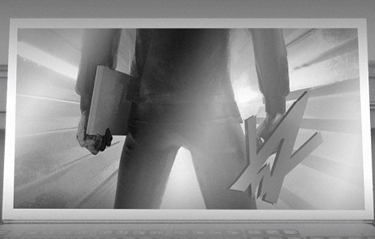
Lars also asked if I could make a poster: “Since this film is going to be more in the style of Gremlins, I’d like to give them a pastiche of the classic Gremlins poster in the pitch. But instead of Mogwai, it’s going to be Chucky in the box. Make it really simple, in the same style as the storyboards.”

Well, it was a task too fun to not do a little extra. I worked a whole night making it the way I wanted.
We discussed style and the schedule for the coming week. We both went home with homework. The next evening, Lars sent me the scene he’d chosen, with his modifications. The scriptwriter had approved it – we were good to go.
The practical stage
We worked online and over the phone. From office to office. We started off by going over the draft of the scene. Lars sent me rough boards – his own Lars doodles. We went through these together. Then I made my own drafts for him. After that, he came back with improvements and new ideas for the images, to push the ideas even further. New images kept being added. The storyboard for a scene, the way we did it, is both direction and story development on ‘paper’.


The death scene of the unsympathetic Shane …
Pushing the gory concept
Lars also had some images at the end of the scene with a snowblower and blood and stuff: “But we’ll prioritize this part first. And then we can always come back to this. AND, feel free to come up with your own stuff. Remember that it’s horror with comedy, so it’s important to convey the Christmas lights around the body and other humorous features. Pain, screams, faces, etc.”
He also sent me the first version of his lookbook* for inspiration for scene design, blocking, and composition.
Moving towards the deadline
We kept passing the scene back and forth between us. Lars kept coming up with new improvements, and pushed us to take things as far as we could. He asked me to keep humour and horror in my mind, and was open to my ideas. It was an exciting process. The scene’s basic concept became more and more refined, and the deadline drew closer. In the final phase, we worked on the unlikable dad Shane’s death scene. According to the script, his head was supposed to end up in the snow blower. Lars referenced 80s slasher films that could be funny even when someone died. He never stopped repeating: “Don’t forget to mix humour and horror!”
We didn’t need to see details to understand that something horrible had happened. But could we have some peculiar facial expressions, or put blood spatters on the snowman? I suggested that Shane’s scalp could be cut off by the snowblower when he flew through the air, and then land on the snowman’s head. Lars laughed and said it was an idea that he liked. We would keep it.
Final shot
The final shot would be Chucky holding up a knife, ready to start hewing, with the moon in the background. But, Lars didn’t want Chucky to start hewing in this iconic image that we had just composed. So, we added an image. It would be a close-up of a hand with a knife – with an arrow to indicate movement. We were now pretty much finished.
The last lap
All that remained now was some final touches by me. Lars had a bit more to do on his director’s comments for the pitch, and to tweak the lookbook. Then he sent in the whole pitch with the Gremlins pastiche as a cover. I was so excited that I could hardly sleep that night.
Fast response
The very next day, Lars heard from the client. Very good feedback on both the lookbook and storyboards! And a few hours later, the production company confirmed that he had the job.
Approved supplier?
Although Lars Klevberg was my client on the pitch, I had to be approved and had to sign a contract in order to continue working on the project. What Lars did next was amazing – he did a sales pitch for me as a supplier! I was hired and continued working on storyboards and a few concept designs. The scene we had delivered was to be changed from winter to summer. The snowman became a small garden gnome. But that’s another story.


The gnome in the garden was originally intended to be a snowman…
Fun Fact
I have to add that my big childhood hero Luke Skywalker, or Mark Hamill, took on the task of being the voice of Chucky. It’s incredibly fun to have worked on the same movie as the greatest Jedi Knight of them all 🙂
*A lookbook is a collection of stills from film and TV, photographs or other kinds of visuals that are compiled to help illustrate a filmmaker’s vision for a film. It acts as a reference for the sense of how a film should look and feel. The book includes ideas for cuts, cinematography, production design and casting. Most lookbooks aim to visually communicate ideas and concepts for things like colours, lighting styles, moods and other references.
-
LATEST BLOGS / NYESTE ARTIKLER
Latest blogs on topics related to my core knowledge and that might interest you or me.Siste artikler om emner som kan interessere deg eller meg.
-
Won pitch in Hollywood with Norwegian storyboard
4 years ago – 11 min lesetid – Norsk tekstNorwegian storyboard artist helped Norwegian director to pitch on horror film for American film production. The project was a remake of Childs Play with the legend Chucky for MGM (Metro-Goldwyn-Mayer) in Hollywood! >>#ENGLISH, #FILMPRODUCTION, #STORYBOARD -
Vant pitch i Hollywood med norsk storyboard!
4 years ago – 11 min lesetid – Norsk tekstNorsk storyboard-artist hjelper Norsk regissør å pitche på skrekkfilm for Amerikansk filmproduksjon. Det gjaldt nyinspillingen av Childs Play med legenden Chucky for MGM (Metro-Goldwyn-Mayer) i Hollywood! >>#FILMPRODUKSJON, #KONSEPTUTVIKLING, #NORSK, #STORYBOARD -
Concept boards for Alan Walker and ROG commercial
4 years ago – 4 min read – English textConcept boards for Alan Walker and ROG (Republic of Gamers) commercials by storyboard artist Raymond Johansen.#ENGLISH, #FILMCONTENT, #STORYBOARD -
NORSK STORYBOARD ARTIST I EUROPA
4 years ago – 7 min lesetid – Norsk tekstNorsk storyboard artist på jobb på oppdrag i europa og Malta for Amerikanske Amblin entertainment.#FILMPRODUKSJON, #NORSK, #STORYBOARD -
Skisset storyboard for reklamefilm til Alan Walker
4 years ago – 4 min lesetid – Norsk tekststoryboardskisser for reklamefilm for Alan Walker og ROG (Republic of Gamers) av storyboard-tegneren Raymond Johansen.#FILMPRODUKSJON, #NORSK, #STORYBOARD


